Rethinking Network Data Visualization with a ‘Breathing’ Animation

Researchers at the University of Wisconsin-Madison are proposing a groundbreaking approach to visualizing network telemetry data, one that transforms traditional time-series graphs into animated ‘breathing’ maps of network delay. According to a detailed post by PhD student Stephen Jasina, this method uses Riemannian Geometry and manifold interpolation to better illustrate how networks perform and evolve over time.
Visualizing Network ‘Breathing’: A New Approach

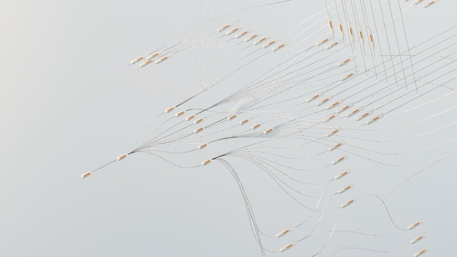
The team’s solution replaces standard line graphs of round-trip times (RTTs) between routers with 3D surfaces, known as network delay spaces. Each surface represents a snapshot of network performance, with geodesic paths corresponding to latency between endpoints. By animating these surfaces over time, researchers can observe the network’s dynamics, effectively showing how it “breathes.” For example, using publicly available data from ESnet, a Department of Energy-funded high-performance network, they mapped 56 routers and over 100,000 measurements into an animated visualization.
This novel approach highlights anomalies and patterns that may go unnoticed in conventional visualizations. For instance, a large spike in latency in the Utah/Colorado region coincided with a shift in the network topology seen in the animation. Unlike static graphs, this provides critical geographic and operational context for network operators, helping them debug issues faster.
Why This Matters: The Challenge of Growing Network Data

As networks scale and telemetry datasets become increasingly large, traditional tools, such as line graphs and scatter plots, struggle to provide actionable insights. The need for innovative visualization techniques is growing, particularly for multidimensional spatiotemporal data like RTTs. Industry analysts often cite operational efficiency, reliability, and quick anomaly detection as critical priorities for telecom operators, making enhanced visualizations a strategic necessity.
ESnet’s application of this method underscores its relevance to real-world networks. With complex infrastructures underpinning 5G, fiber, and satellite systems, visualizations that map performance in real-time can accelerate decision-making and reduce downtime.
What Comes Next for Telecom Operators
This work signals an important direction for telecom and networking researchers. By embracing advanced mathematical tools and creative visualizations, the field can unlock deeper insights into network performance and resilience. Potential future applications could include predictive modeling, real-time anomaly detection, and optimized routing algorithms for traffic-heavy networks.
Market watchers will note that this approach could inspire commercial implementations in network monitoring tools. Companies specializing in network analytics, such as Cisco and Nokia, might consider leveraging similar techniques to differentiate their platforms in an increasingly crowded market.
As networks become more complex, the ability to visualize and explain their behavior will only grow in importance. Does your organization have the tools to keep up?